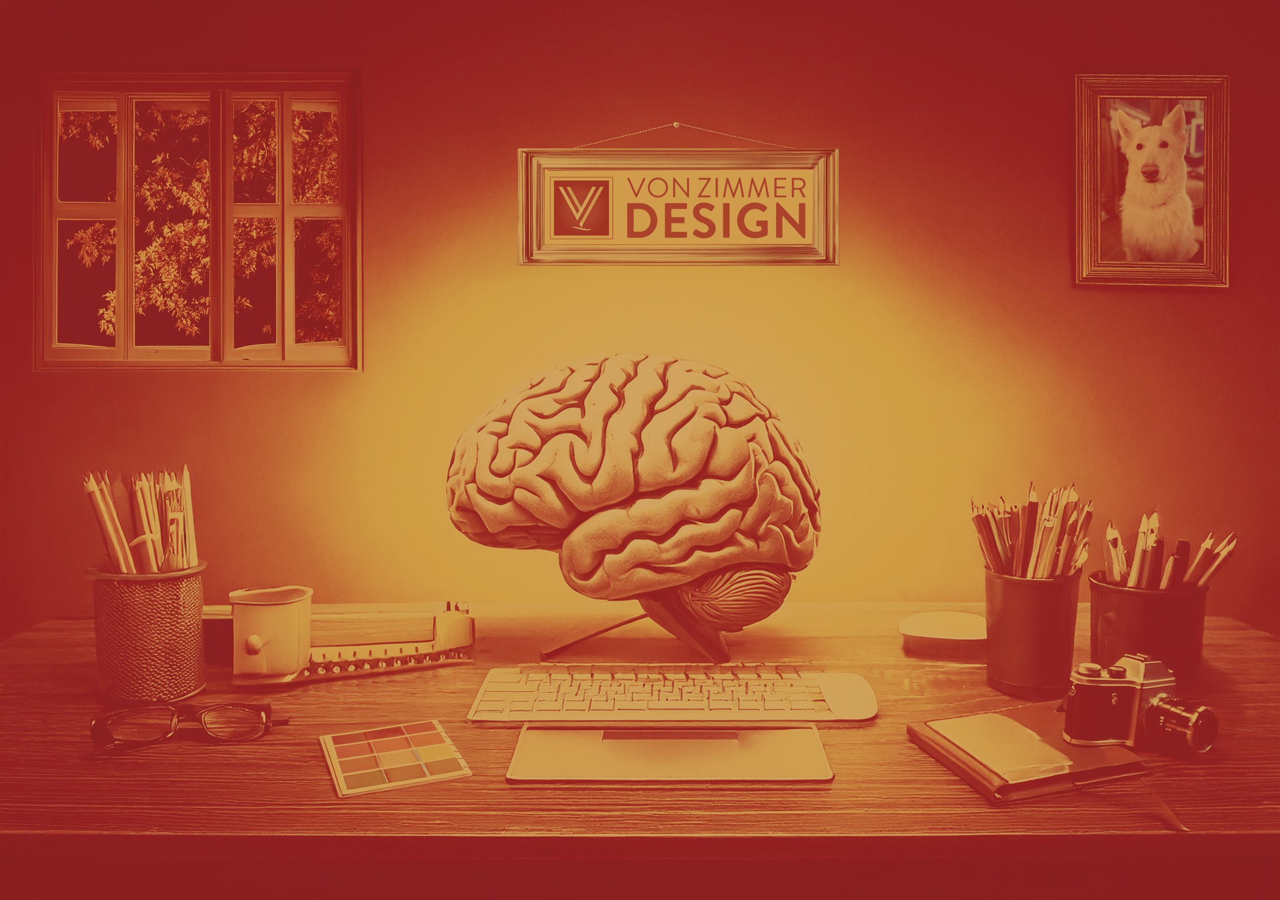
The Power of Color Psychology in Graphic Design
Color is more than just a visual element in graphic design—it’s a powerful psychological tool that influences perception, emotions, and behavior. Whether designing a brand logo, a website, or a marketing campaign, understanding color psychology allows designers to create visuals that effectively communicate messages and resonate with audiences.
The Emotional Impact of Colors
Let’s consider some main colors used in advertising. Different colors evoke distinct emotions and associations:
Red: Excitement, urgency (used in sales and fast food).
Blue: Trust, calm (popular in corporate and healthcare branding).
Yellow: Optimism, warmth (used in friendly, inviting brands).
Green: Nature, growth (common in eco-friendly and financial branding).
Black: Luxury, sophistication (favored by high-end brands).
White: Simplicity, purity (seen in minimalist and healthcare designs).
Purple: Creativity, wisdom (used in beauty and wellness brands).
Orange: Energy, enthusiasm (seen in fun, engaging brands).
Color in Branding and Design
Brands use color to shape identity and consumer perception. Fast-food chains leverage red and yellow to stimulate appetite, while financial institutions favor blue to convey reliability. Cultural meanings also impact color perception, making audience awareness essential.
Conclusion: Effective Use in Design
Designers must consider contrast and readability, brand identity, and emotional impact when choosing colors. A wellness brand may use calming blues and greens, while a luxury brand might opt for black and gold.
By applying color psychology strategically, designers can create visually compelling, emotionally resonant, and highly effective designs that leave a lasting impression … and a happy client.


