



Why Most Infographics Fail (And What Policy Work Taught Me Instead)
Infographics are everywhere—and most of them don’t work. They’re busy, over-designed, and trying to do too much at once. You can tell a lot of effort went into them. You just can’t tell what you’re supposed to take away.
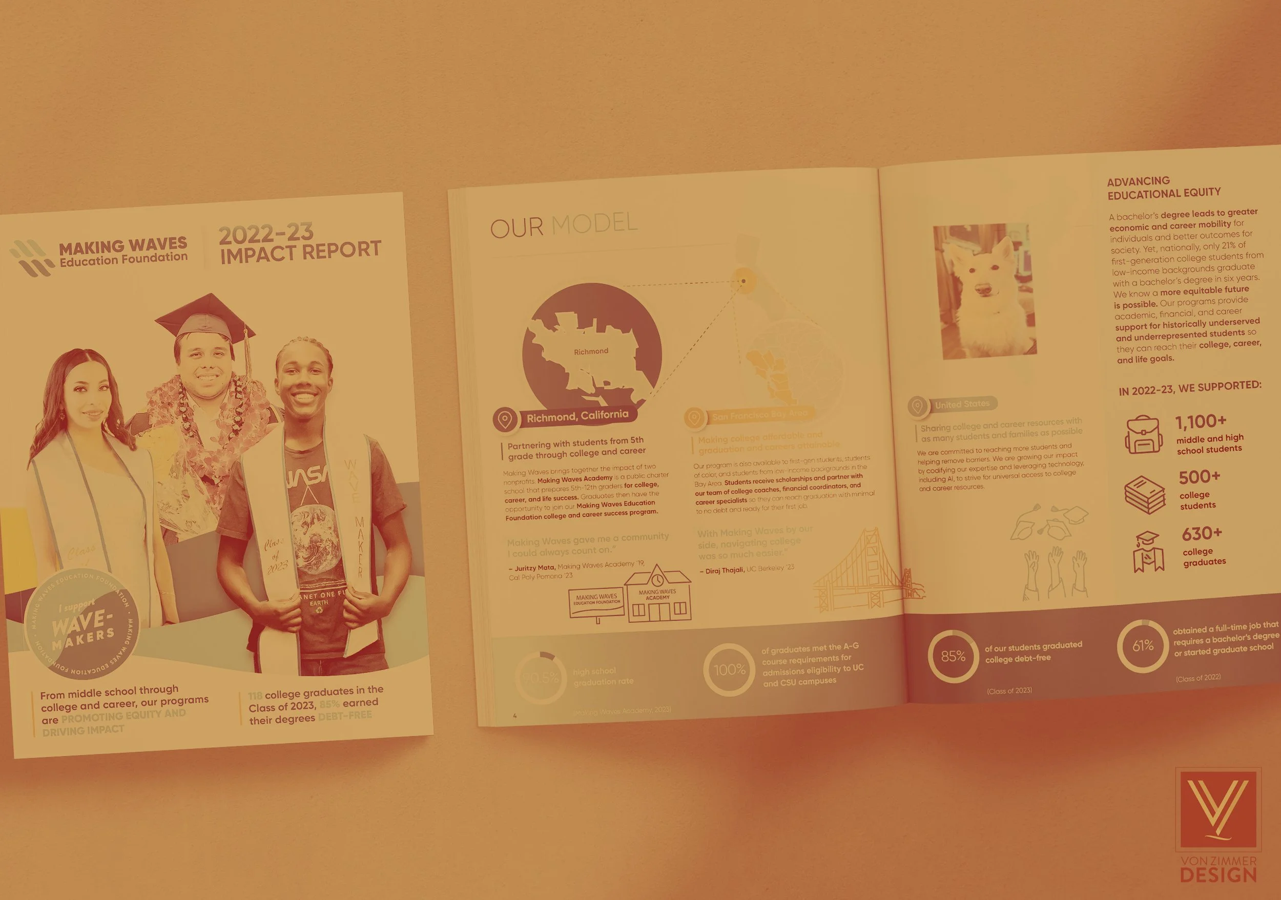
What Nonprofits Get Wrong About Design (And How to Fix It)
After more than two decades working with nonprofits, I’ve seen this over and over: When something isn’t landing, it’s rarely a design problem. It’s a clarity problem. Design just happens to be where that lack of clarity becomes visible.

In Defense of White Space
Every designer has faced this moment. You’re meeting with a client, presenting a clean, well-balanced layout, and they pause. They like it overall, but their eyes go straight to the logo at the top. “Shouldn’t there be something next to it?” they ask.

Minimalism and Graphic Design
Minimalism has always been one of my favorite graphic design styles, and few movements exemplify it better than Bauhaus and Swiss Design. In this post we’ll focus on Bauhaus.